How to Design Compliant and Attractive 3.5g Edible Packaging?
You need to package a 3.5g edible, but the tiny space is a design nightmare. How do you fit branding, warnings, and required info without it looking cluttered and unprofessional?
To design 3.5g edible packaging1, you must strategically balance regulatory needs2 with consumer appeal. Combine clear labeling3, premium finishes4, and user-friendly functional design5 to ensure compliance and market success.

I once had a client, a gourmet chocolate maker, who wanted to enter the cannabis edibles market. They created a beautiful 3.5-gram chocolate square but tried to cram their existing, elaborate branding onto a tiny wrapper. It was a mess. All the legal warnings made it illegible, and the beautiful design was lost. They were frustrated, feeling they had to choose between being legal and being beautiful. We went back to the drawing board and focused on a minimalist approach—a simple logo, a single color for each flavor, and a QR code for all the extra details. The final product looked clean, premium, and stood out. It proved that in small formats, less is almost always more.
Why is it important to understand the 3.5g format and market demand?
You see this 3.5g size everywhere, but why is it so special? It seems like a random number, so why should you focus your design efforts on this specific format?
The 3.5g format is popular because it's perfect for dose control6 and offers a premium, single-serving experience. It's a key size in cannabis edibles, gourmet snacks7, and high-value supplements.

For a designer like Jacky, understanding the "why" behind a format is key to creating a successful design. The 3.5g (or one-eighth of an ounce) size has its roots in cannabis culture, but its appeal is much broader now. In the world of edibles, it represents a standard, often single, dose. This gives consumers a sense of control and safety. For gourmet foods, it's the perfect "treat" size—a small indulgence that feels luxurious without being a huge commitment. This format inherently communicates precision and quality. A brand isn't just selling a snack; it's selling an experience. Therefore, the packaging design must reflect this premium, controlled nature. It needs to feel more like a small piece of jewelry and less like a bulk candy wrapper.
What are the key compliance requirements for 3.5g edibles?
You have a great design, but you're terrified of the legal rules. What are the absolute must-haves you need on the package to avoid regulatory trouble?
Key compliance requirements include clear disclosure of active ingredients like THC/CBD, full nutritional information and allergen warnings, an expiration date8, and adherence to specific local and national regulations.

Navigating compliance is the most important—and often the most difficult—part of designing edible packaging. There is no room for error. The small size makes it even harder, so you have to be efficient with your space.
| Requirement Category | Key Information to Include | Design Consideration |
|---|---|---|
| Active Ingredients | Total THC/CBD content9 per package and per serving. | Must be prominent and easy to read. Often requires a specific warning symbol. |
| Food Safety Info | Nutrition facts panel, ingredient list, allergen warnings. | Can be in small but legible font. Often placed on the back. |
| Tracking Info | Expiration date, lot number, manufacturing date. | Essential for recalls. Must be clearly printed and durable. |
| Regional Regulations | Specific warnings, language requirements, symbols. | Varies hugely by country and state/province. Research is critical. |
For a Canadian designer like Jacky, the rules set by Health Canada will be the guiding document. A great strategy for handling the sheer volume of information on a tiny pack is to use a QR code. This allows you to place only the most critical warnings on the package itself, while linking to a webpage with more detailed information like full lab results.
What are the core functional features needed?
Your package looks amazing, but is it actually easy to use? What are the essential functional elements that will make customers love—not hate—your product's packaging?
The core functional features are a child-resistant mechanism10 that is still easy for adults to open, a high-quality barrier to protect freshness, and a compact, stackable shape for retail efficiency.

A package's functional design has a huge impact on the customer's perception of your brand. If it fails, they may not buy it again, no matter how good the product inside is.
Easy-open yet child-resistant
This is the number one functional challenge. The mechanism must meet strict government standards for child safety. However, it can't be so difficult to open that it frustrates your adult customers, especially medical patients who may have dexterity issues. Clever designs like "press-and-turn" caps or "pinch-and-slide" boxes are common solutions.
Moisture and oxygen barrier
Edibles are food products. They can go stale, lose their flavor, or absorb odors if not protected. The packaging material must have a strong barrier layer, often made from foil or specialized films, to lock out moisture and oxygen. This ensures the product is as fresh on day 60 as it was on day one.
Compact and stackable for retail
A design that is easy for a dispensary to stock is a design that will get reordered. A small, square, or rectangular tin is much more efficient than an odd-shaped, bulky pouch. A stackable design maximizes shelf space, which makes retailers very happy.
What are some effective visual appeal strategies?
With all the compliance rules and functional needs, how can you still make your 3.5g package look beautiful and stand out on the shelf?
Use smart color coding11 to differentiate flavors or potencies, embrace minimalist labeling12 to create a sophisticated feel, and invest in premium finishes4 like matte textures or foil stamping to add tactile value.

On a small package, you don't have space for busy graphics. You have to be strategic and make every design element count. The goal is to communicate your brand's essence at a quick glance. A fantastic way to do this is with a strong color system. Assigning a unique, bold color to each flavor or product type (e.g., blue for "sleep," yellow for "energy") acts as a visual shortcut for repeat customers. They can spot their favorite product from across the room. Combine this with a minimalist design approach. Use plenty of white space and focus on a single, strong logo. This communicates confidence and makes the product feel more high-end. Finally, don't forget about touch. The way a package feels in the hand is a huge part of its appeal. A soft-touch matte finish, a bit of shiny gold foil, or an embossed logo can elevate a simple box into a memorable, premium experience.
What are the branding opportunities in small formats?
You might feel like the small 3.5g size limits your ability to tell your brand's story. How can you turn this constraint into a creative advantage?
The small format is perfect for launching limited-edition seasonal designs13 that create excitement. You can also use QR codes14 to turn the package into a digital gateway to your brand's story and certifications.

Don't see the small size as a limitation. See it as a canvas for focused, high-impact branding. Because the production runs are often for smaller quantities, the 3.5g format is ideal for experimenting with special editions. Think of a pumpkin spice flavor for the fall with a unique orange and brown design, or a peppermint flavor for the winter holidays. These limited runs create a sense of urgency and collectibility, encouraging customers to buy now before they're gone. The other massive opportunity is the QR code. This little square can be your portal to endless storytelling. A customer can scan it in the store to instantly see lab results, watch a video about how your product is made, read your founder's story, or get recipe ideas. It transforms a static package into an interactive experience, building a much deeper connection with your brand.
What are some real-world case studies?
You've heard the theories, but what does this look like in practice? How have real brands successfully designed their 3.5g edible packaging?
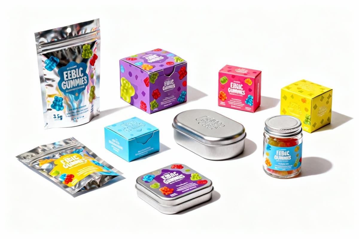
Successful examples include a cannabis gummy brand using sleek, recyclable metal tins with pop-top lids, and a luxury chocolate line using individually wrapped, sealed 3.5g squares within a larger elegant box.

Looking at successful brands is a great way to get inspired. I worked with a gummy company that wanted to be seen as modern and sustainable. Instead of a plastic pouch, we used a small, round metal tin that was fully recyclable. It had a satisfying "pop" when opened, which created a great user experience. The design was minimalist, with just their logo and a single color to denote the flavor. It felt premium and responsible, which was perfect for their brand. Another example is a high-end chocolate brand. They sold their edibles in a larger, beautiful box, but inside, each 3.5g chocolate piece was individually wrapped in gold foil paper. This approach created a sense of ceremony and luxury when opening it. It also perfectly controlled the dosage. In both cases, the packaging was designed to enhance the specific experience of consuming that product.
What are the future trends for 3.5g edible packaging?
You want your design to be modern and forward-thinking. What new technologies and materials are on the horizon that will shape the future of small-format packaging?
Future trends include smart labels15 that change color to indicate freshness, the development of fully compostable barrier films16, and the use of micro-AR experiences to engage and entertain consumers.

The future of packaging is all about being smarter, more sustainable, and more interactive. We're starting to see "smart labels" that can actively monitor the product. Imagine a small icon on your package that is green when the product is fresh and slowly turns red as it nears its expiration date. This provides a huge benefit to consumers and retailers. In materials science, the biggest goal is creating a fully plant-based, compostable film that has the same barrier properties as plastic and foil. This would be a game-changer for sustainability. Finally, the interactive elements will get more advanced. Instead of just linking to a website, a QR code or NFC chip might launch a mini augmented reality (AR) game or a 3D animation that teaches the user about terpenes. The package will become a key to unlocking a whole digital world built around the brand.
Conclusion
Designing 3.5g edible packaging is a challenge of balance. By prioritizing compliance, focusing on the user, and using minimalist design, you can create a package that is safe, attractive, and successful.
Explore best practices to create compliant and attractive packaging that stands out in the market. ↩
Understanding regulatory needs is crucial for compliance and avoiding legal issues in packaging. ↩
Clear labeling enhances consumer trust and ensures compliance with legal requirements. ↩
Premium finishes can elevate the perceived value of your product and attract consumers. ↩
User-friendly designs improve customer experience and encourage repeat purchases. ↩
Dose control ensures consumer safety and enhances the product's appeal. ↩
Stay updated on trends to create appealing packaging for gourmet snacks. ↩
An expiration date is crucial for consumer safety and product quality. ↩
Proper disclosure of THC/CBD content is essential for compliance and consumer safety. ↩
Explore innovative child-resistant designs that ensure safety without sacrificing usability. ↩
Color coding helps consumers quickly identify flavors and enhances brand recognition. ↩
Minimalist labeling creates a sophisticated look and communicates brand confidence. ↩
Limited editions create excitement and urgency, driving consumer purchases. ↩
QR codes can provide additional information and create an interactive experience. ↩
Smart labels can improve product tracking and enhance consumer experience. ↩
Compostable films are a sustainable option that can reduce environmental impact. ↩