How Can Your 3.5g Edible Packaging Dominate the Retail Shelf?
Your amazing 3.5g edible is ready for the world. But on a crowded retail shelf, it's completely invisible, lost among dozens of louder, bigger competitors in the dispensary.
Effective branding for 3.5g packaging requires bold colors, clear typography, and smart label placement. This creates a strong, compliant brand identity that grabs attention and stands out instantly on competitive shelves.

I remember working with a startup that made fantastic little 3.5g fruit chews. They spent a fortune on a minimalist, pastel-colored design that looked gorgeous in a design portfolio. But in the store, it was a disaster. It just blended in with the shelf itself. The founder called me, frustrated, saying, "Kevin, we have the best product, but nobody is even seeing it to try it!" We didn't need to reinvent the brand. We just took their existing logo and put it on a vibrant, single-color background that contrasted with their competitors. It wasn't about being the most artistic; it was about being the most visible. Sales doubled in three months. That's the power of shelf-aware branding.
How Do You Create Maximum Shelf Impact with a Tiny Package?
Your tiny 3.5g package has very little surface area. It's easily overshadowed by larger products, making it nearly impossible for a shopper to notice from a few feet away.
To maximize impact, think of your small packages as a group. Use a display-ready tray with repeating colors and patterns to create a large, unified "billboard effect" that is impossible to ignore.

As a designer, Jacky knows that a single 3.5g package is a whisper. To be heard in a loud retail environment, you need to turn that whisper into a shout. The way to do this is by thinking beyond the individual unit and focusing on the collective. The "billboard effect" is a strategy where you use multiple units to create one large, cohesive visual statement. When a retailer places your product on the shelf, it's usually in a display-ready tray. You need to design this tray and your packages to work together. Use a bold, repeating pattern or a solid block of a unique brand color. When 20 of your packages are lined up, they should merge into one big, eye-catching image. This makes your brand visible from across the aisle, not just up close. It draws the customer in, and only then does the design of the individual package matter.
How Do You Integrate Complex Compliance Labels Without Ruining Your Design?
Mandatory legal warnings and ingredient lists are ugly. They take up precious real estate on your tiny package, leaving you with no room for your brand's beautiful design elements.
Treat compliance not as a burden, but as a design element. Create a dedicated, organized "information zone" on the back or sides, using clean typography and clear hierarchy to maintain a clean brand face.

This is one of the biggest frustrations for designers like Jacky. You create a masterpiece, and then reality hits: you need to add a giant THC warning symbol, a nutrition panel, and lines of legal text. The key is to plan for this from the very beginning. I always advise my clients to divide their package into distinct zones.
A Smart Zoning Strategy
- The Brand Zone (Front): This is sacred space. It should contain only the most critical elements: your logo, the product name/flavor, and maybe one key benefit (e.g., "Fast-Acting"). This side's job is to attract the customer.
- The Information Zone (Back/Sides): This is where all the mandatory text lives. Don't just paste it in. Design it. Use a clean, legible sans-serif font. Use headings and bullet points to break up text. Align everything to a grid.
- The Interactive Zone (Optional): This is a great place for a small QR code. It can link to lab results, your brand story, or recipes. This shows transparency and adds value without cluttering the package.
By organizing the information this way, you respect the law while protecting your brand's aesthetic. The package looks professional and intentional, not like a design compromised by legal afterthoughts.
What Color and Typography Strategies Work Best for Small Packages?
You're trying to choose colors and fonts, but everything feels cluttered on the small package. The text is unreadable from a distance, and the colors don't pop on the shelf.
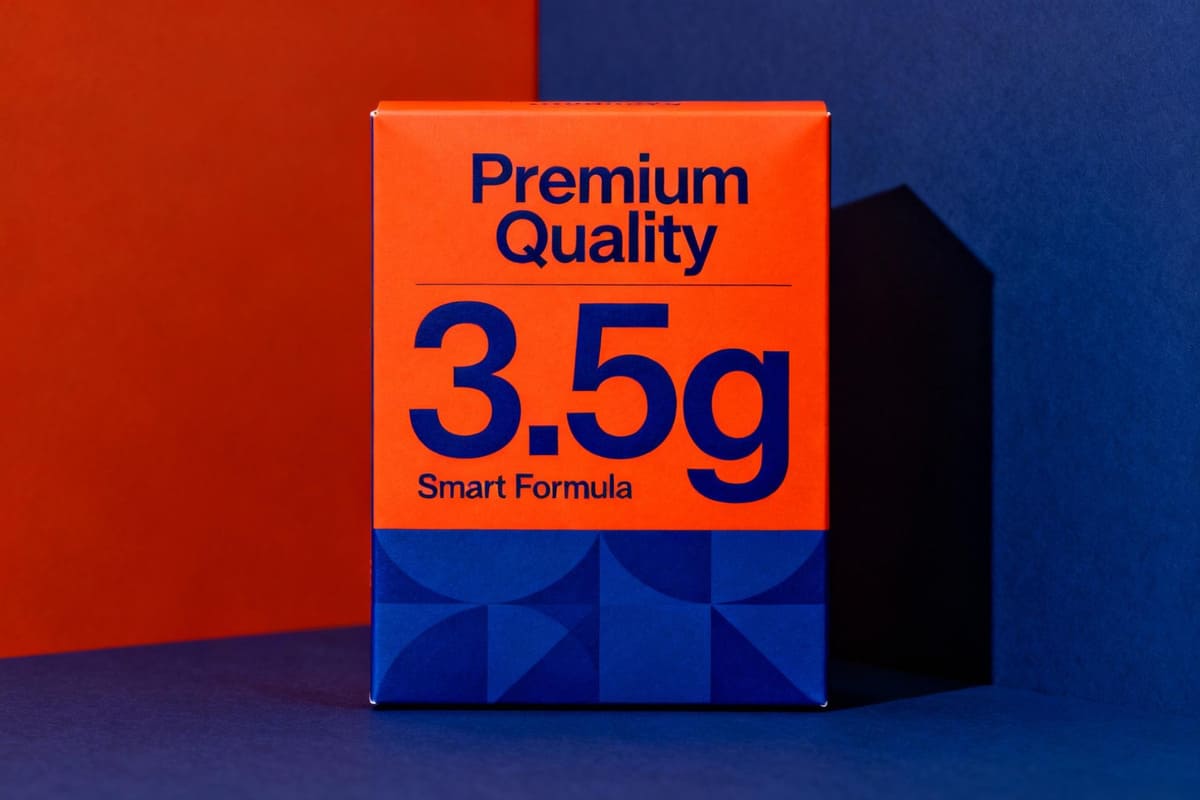
Use a simple, high-contrast color palette with one dominant brand color. Pair this with a single, bold, sans-serif font for product names to ensure maximum legibility from a distance.

On a small canvas, less is more. The goal is instant recognition. A complex, multi-colored design with delicate fonts will just turn into a blurry mess from five feet away. Think of it like a highway billboard; you only have a few seconds to communicate your message.
| Strategy | Why It Works for Small Packages | Example |
|---|---|---|
| Monochromatic+ | Using one strong brand color with black or white text. | A bright yellow package with bold black text. |
| High Contrast | Pairing complementary colors (like blue and orange) for visual vibration. | An electric blue logo on a vibrant orange box. |
| Bold Sans-Serif Fonts | Fonts like Helvetica, Futura, or Montserrat are clean and easy to read at small sizes and from far away. | "GUMMIES" written in a thick, clear font. |
| Font Hierarchy | Using one bold font for the name, and a smaller, simpler version for the flavor. | Big "CHOCOLATE" with smaller "Sea Salt" text. |
Avoid thin, script, or overly decorative fonts for primary information. Save those for a small decorative element if you must, but prioritize legibility above all else. Your customer needs to be able to identify your product and flavor in a single glance.
How Can You Use Limited Edition Branding on a Small Format?
You want to create excitement with seasonal or limited-edition flavors. But with such a small package, how do you make it feel special without completely redesigning your core packaging?
Keep your main brand identity consistent, but change one key element. Use a unique color or a simple icon to signal the special edition, making it instantly recognizable and creating collectibility.

Limited editions are a fantastic way to drive sales and create brand hype. The secret to doing this effectively on a small package is to follow the "80/20" rule. 80% of your packaging should remain consistent with your core brand. This includes your logo, its placement, and the main typography. This ensures that your customers can still recognize your brand instantly. The other 20% is where you play. This is usually the background color or a small, illustrative element. For a holiday edition, you might change your standard blue background to a festive red and add a simple snowflake icon. For a summer edition, you could switch to a bright yellow with a small sun graphic. This approach is smart for a few reasons. First, it's cost-effective; you're not redesigning everything, just changing colors or a small graphic plate during printing. Second, it creates a "collectible" feel. Customers who love your brand will want to try every new variation. It builds excitement and loyalty without confusing your core brand identity.
What Can We Learn from Retail Case Studies on Small-Format Edibles?
Theory is great, but what branding strategies are actually working in stores right now? What can we learn from successful brands that have mastered the 3.5g format?
Successful brands use a "brand blocking" strategy with color to own shelf space. They also use minimalist design with ultra-clear flavor callouts, ensuring customers can make a quick, confident choice.

When I walk through a dispensary for market research, two strategies consistently stand out. The first is Brand Blocking with Color. A brand like Wana is a master of this. They have a dozen different SKUs, and each one has its own vibrant, distinct color. When a retailer stocks them together, they create a huge rainbow block on the shelf that is impossible to miss. It draws your eye from anywhere in the store. Your brain immediately recognizes that entire section as "Wana" before you even read a word. The second strategy is Extreme Clarity. Brands like Kiva, with their Camino gummies, excel here. Their packaging is clean and simple. The brand logo is clear, but the most prominent text is the flavor and the feeling, like "Pineapple Habanero - Uplifting." In a crowded and sometimes confusing market, this direct communication is a massive advantage. A customer can glance at it and know instantly what it is, what it tastes like, and what effect to expect. This removes friction from the buying decision and builds trust through transparency.
Conclusion
Mastering 3.5g packaging isn't about being the loudest. It's about being the clearest, using bold color, clean design, and smart strategy to stand out in a crowded retail world.