How Can Cannabis Packaging Improve Shelf Appeal and Consumer Recognition?
Your high-quality cannabis product sits on a crowded dispensary shelf, completely unnoticed. Dozens of other brands are shouting for attention, and your great product gets lost in the noise.
Cannabis packaging1 improves shelf appeal2 with distinctive design3, consistent branding4, and user-friendly features5. This builds consumer recognition and trust, leading directly to better sales and brand loyalty.
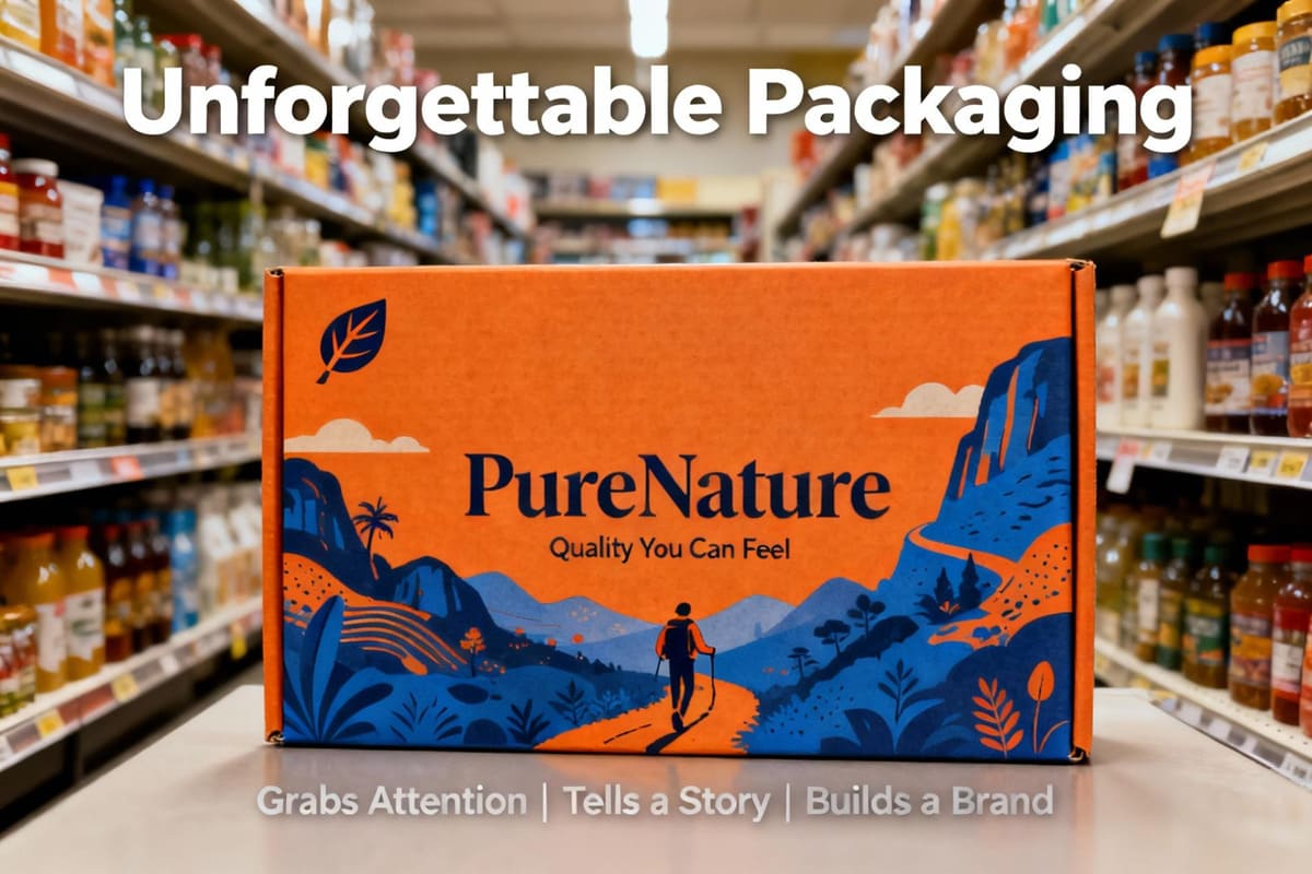
I worked with a brand that had a fantastic product but terrible packaging. It was a generic black pouch that looked like a dozen others. During a store visit, I watched three customers in a row pick it up, look at it with confusion, and put it back down. The owner was frustrated, saying, "If they would just try it, they'd love it!" The problem wasn't the product; it was the packaging's failure to make a promise. We redesigned their entire line with a bold color system and a clear, memorable logo. The next time I visited that store, their products were flying off the shelf. That's the power of a great first impression.
Why does shelf appeal matter so much in cannabis retail?
You feel your product's quality should speak for itself. But in a store with hundreds of options, how can you even get a customer's attention to make that first sale?
Shelf appeal is critical because it's the first point of contact in a competitive retail space. Your packaging is your silent salesperson, and its design directly influences a customer's purchase decision.
Think of a dispensary shelf as a silent, crowded party. Every product is trying to start a conversation with the customer. In this environment, you have about three seconds to get noticed. This is where a designer like Jacky's work becomes absolutely crucial. If your packaging is generic or confusing, the customer's eye will just slide right past it. But if it has a strong, clear design, it breaks through the visual clutter and makes a connection. It communicates everything from your brand's personality—are you fun, medical, or luxurious?—to the product's key details, like its type and potency. In many cases, especially for new customers, the package is the single most important factor in their decision to try your brand for the first time.
What are the key packaging elements that boost shelf appeal?
You know "good design" is important, but what does that actually mean? Which specific visual elements will make a customer notice your product and feel compelled to pick it up?
The key elements are a strategic use of color and visual hierarchy6, clear typography7 and iconography8, and engaging finishes and textures that create a memorable tactile experience9 for the customer.
Creating powerful shelf appeal is a science. It's about using a toolbox of design elements to guide the customer's eye and create a feeling of quality. As a designer, Jacky would focus on these three core areas.
Color & Visual Hierarchy
Color is the first thing the brain processes. Using a bold, unique color that still fits your brand's vibe can make your product pop from ten feet away. But color alone isn't enough. You need hierarchy. This means using size, color, and placement to guide the customer's eye in a specific order: first to your brand logo, then to the strain name, and finally to the key information like THC/CBD content. This makes your package easy to understand in seconds.
Typography & Iconography
A creative font that's hard to read is a design failure. The goal is clarity. Your typography must be legible, even from a distance. Icons are also a powerful tool. A simple, clean icon for "Sativa," "Indica," or "Hybrid" is a universal language that every cannabis consumer understands. It provides crucial information instantly without cluttering the design.
Finish & Texture
What happens when a customer picks up the box? The tactile experience is just as important as the visual one. A soft-touch matte finish feels premium and luxurious. A spot gloss finish can highlight your logo. Embossing or debossing a pattern adds a layer of texture that is interesting to touch and makes your brand feel more high-end and memorable.
How can you build strong consumer recognition?
Getting a customer to buy your product once is a good start. But how do you get them to remember your brand and look for it the next time they shop?
Build strong recognition through absolute consistency in your branding across all products. Use your packaging to tell your unique brand story, which creates an emotional connection and fosters customer loyalty.
Shelf appeal gets the first sale, but brand recognition creates a loyal, repeat customer. This is where design moves from just being decoration to being a core business asset. The most important rule is consistency. Your logo, your brand colors, and your typography should be the same on your flower jar, your vape box, and your edible wrapper. When a customer sees your products on the shelf, they should instantly recognize them as a family. This creates a "brand block"—a larger, more impactful visual presence on the shelf that makes your brand look more established and trustworthy. Beyond visual consistency, use the package to tell a story. A small icon indicating you're a family-owned farm, a short sentence about your sustainable growing methods, or a unique name for your product line can create a hook. It gives the customer something to connect with on an emotional level, turning a simple transaction into the beginning of a brand relationship.
What functional features influence both appeal and use?
A beautiful box is great, but what if it's hard to open or doesn't keep the product fresh? How do you design a package that is both attractive and genuinely useful?
The best designs integrate functional features that improve the user experience. This includes child-resistant closures10 that aren't frustrating for adults, resealable locks11 for freshness, and clear dosage information.
This is an area where packaging design12ers like Jacky can truly shine. A package that fails in its function will frustrate the customer, no matter how good it looks. First and foremost is the opening experience. All packaging must be child-resistant, but that shouldn't mean it's "adult-proof." The goal is a mechanism that is secure but intuitive for an adult to open without needing tools or excessive force. A frustrating opening experience can sour a customer's perception of your brand. Second is product preservation. For products like flower or edibles, a resealable zipper or a gasket-sealed lid is essential. It shows that you care about the customer's experience long after the initial purchase and want them to enjoy a fresh product every time. Finally, for products like edibles or tinctures, clear functional design around dosage is key. This includes visible portion lines on a chocolate bar or clear markings on a dropper. This isn't just a feature; it's a critical part of building consumer trust and ensuring a safe experience.
How can you achieve compliance without compromising appeal?
You have a sleek, minimalist design in mind, but you're worried that the huge warning labels and regulatory text will ruin it. How can you stay compliant while keeping your design clean?
Integrate compliance information13 thoughtfully into your design's hierarchy instead of just slapping it on. Use QR codes to move lengthy text off the package, freeing up space for your branding.
Compliance is a non-negotiable reality in the cannabis industry, but it doesn't have to be the enemy of good design. The worst mistake I see is when brands treat regulatory information as an afterthought. They design a beautiful box and then, at the last minute, slap a huge warning label right over the logo. The key is to plan for compliance from the very beginning. Create a dedicated, organized space on your package—usually on the back or side—for all the required text and symbols. Use a clean, legible font and a grid layout to make the information look orderly and intentional, not chaotic. An even better strategy is to use technology. A small, cleanly designed QR code can link to a webpage with all the detailed lab results, state-specific warnings, and legal text. This keeps your physical package clean and focused on your brand message, while still providing customers with easy access to all the information they need.
What are some case studies of successful cannabis packaging?
Theory is helpful, but what does success look like in the real world? How have different types of brands used packaging design12 to capture their specific target markets?
A premium brand14 might use a minimalist glass jar with gold foil. An eco-conscious brand15 succeeds with kraft paper and soy inks. A medical line16 builds trust with clinical, clear labeling and dosage charts.
The best packaging always reflects the brand's core identity. There is no single "right" design. I've seen brands succeed with completely different approaches. For a high-end, luxury client, we developed a heavy, weighted glass jar with a simple, elegant label featuring only their logo stamped in gold foil. The design felt exclusive and minimalist, communicating a premium quality before the customer even saw the flower inside. It justified a higher price point. For another client focused on sustainability, we did the opposite. We used a tube made from 100% recycled kraft paper, printed with simple, one-color soy-based ink. The packaging itself told their eco-friendly story. It resonated perfectly with their target audience of environmentally conscious consumers. In the medical market, the goals are different. For a line of medical tinctures, we used a design that looked almost like a pharmaceutical product. We used clean white space, a clinical font, and a clear dosage chart on the side of the box. The design built trust and communicated safety and efficacy.
What are the future trends in cannabis packaging design?
You want your new packaging to feel fresh and modern for years to come. What's next? What are the emerging trends in technology, materials, and design that will shape the future?
Future trends include smart packaging17 with NFC chips and AR experiences, hyper-personalized designs18 for niche markets, and the growing demand for materials that are both sustainable and feel premium.
The world of packaging is always evolving, and the cannabis space is leading the charge with some exciting innovations. The biggest shift will be the rise of "smart" packaging. We're already seeing QR codes, but the next step is embedding NFC (Near Field Communication) chips. This will allow customers to simply tap their phone to the package to get lab results, watch brand videos, or even launch augmented reality experiences19 that bring the brand story to life right in their hands. Another major trend is hyper-personalization. As the market matures, we'll see brands move away from one-size-fits-all designs and create packaging tailored to very specific consumer groups, like wellness-focused seniors or high-energy young adults. Finally, the quest for the perfect material will continue. The holy grail is a material that is fully sustainable and compostable but also has the heft, texture, and visual clarity of premium glass or plastic. The brands that master these new materials will lead the market.
Conclusion
Great packaging does more than just hold a product. It grabs attention, tells a story, and builds a brand. It is your most important tool for winning on the crowded retail shelf.
Explore how effective cannabis packaging can enhance consumer engagement and drive sales. ↩
Learn about the significance of shelf appeal in attracting customers and boosting sales. ↩
Discover how unique design can set your product apart in a competitive market. ↩
Understand the role of consistent branding in building trust and repeat business. ↩
Find out which features enhance the customer experience and satisfaction. ↩
Explore how visual hierarchy can guide consumer attention and improve product visibility. ↩
Learn why legible typography is crucial for effective communication on packaging. ↩
Discover how icons can convey information quickly and effectively to consumers. ↩
Understand how the feel of packaging can influence consumer perception and choice. ↩
Explore effective designs that ensure safety without compromising user experience. ↩
Learn about the benefits of resealable packaging for maintaining product quality. ↩
Understand the essential components that make packaging successful in the market. ↩
Discover strategies for including necessary information without cluttering design. ↩
Explore how luxury packaging can elevate brand perception and justify pricing. ↩
Learn how sustainable packaging can resonate with environmentally aware consumers. ↩
Understand the design elements that build trust in medical cannabis packaging. ↩
Explore the future of packaging with technology that enhances consumer interaction. ↩
Discover how tailored designs can meet the specific needs of niche markets. ↩
Explore how AR can create engaging experiences that connect consumers with brands. ↩