Color Psychology in Packaging: Does It Affect Buyer Decisions?
You’ve designed a beautiful package with your favorite color. But on the shelf, your product isn't selling, and you can't figure out why your competitors are outselling you.
Yes, color psychology1 absolutely affects buyer decisions. Colors trigger subconscious emotions2 and associations about a product's quality, purpose, and brand values. The right color choice3 can directly influence whether a customer even notices your product, let alone buys it.
<sup id=](https://whatapackaging.com/wp-content/uploads/2025/10/provide-an-illustration-for-the-following-text-ye-4.jpg) 4s on a store shelf, with one standing out visually" title="The Impact of Color on Consumer Choice in Packaging" />
4s on a store shelf, with one standing out visually" title="The Impact of Color on Consumer Choice in Packaging" />
I learned this lesson the hard way early in my career. We had a client launching a new health food bar. The product was fantastic, but the designer chose a dark, muted brown for the packaging. It looked premium, but it sat on the shelves. Shoppers walked right past it. Six months later, we relaunched it in a bright, vibrant green5 wrapper. Sales tripled almost overnight without changing the product at all. For a designer like Jacky, understanding why that happened is the key to creating packaging that doesn't just look good, but actually sells. It's not magic; it's psychology.
How Do Different Colors Trigger Specific Emotions in Consumers?
You think the color blue communicates "calm." But in the context of your food product, customers perceive it as artificial or unappetizing, and your sales suffer as a result.
Colors have powerful, learned emotional associations6. Red can create excitement and urgency, green often signals health and nature, and blue typically conveys trust and dependability7. These subconscious cues shape a consumer's initial gut feeling about your product.

Your brain processes color faster than it processes text or even complex shapes. It's a mental shortcut. This is why picking a color is one of the most critical decisions in packaging design4. When I consult with brands, we don't start with "what color do you like?" We start with "what feeling do you want to evoke?" Is the product supposed to be exciting? Trustworthy? Natural? Luxurious? The color is the first step to communicating that core message. A customer looking for a quick energy boost will be instinctively drawn to reds and oranges, while someone looking for a gentle, natural baby lotion will scan for whites, soft blues, and greens. It's an unspoken language between your package and your customer.
A Practical Guide to Color Meanings
While these associations can vary, there are common psychological responses in Western markets that are crucial for a designer in Canada to know. Use this as a starting point.
- Urgency and Excitement: Red is the most powerful color for grabbing attention. It can increase heart rate and create a sense of urgency. It's often used for clearance sales, impulse buys, and energy-focused products.
- Trust and Dependability: Blue conveys security, logic, and professionalism. It's a favorite for financial institutions, tech companies, and cleaning products. It builds a sense of trust and reliability.
- Nature and Health: Green is the easiest color for the eye to process. It's universally associated with nature, health, and sustainability. It's the go-to color for organic foods, natural cosmetics, and eco-friendly products.
| Color | Common Positive Associations | Common Negative Associations | Best For... |
|---|---|---|---|
| Red | Excitement, Passion, Urgency | Danger, Anger, Warning | Impulse Buys, Food, Energy Products |
| Green | Health, Nature, Calm, Freshness | Envy, Blandness | Organic, Eco-Friendly, Health |
| Blue | Trust, Security, Professionalism | Cold, Unappetizing, Unfriendly | Tech, Finance, Corporate Brands |
| Black | Luxury, Sophistication, Power | Mourning, Evil, Oppression | High-End Goods, Fashion, Electronics |
| White | Purity, Simplicity, Cleanliness | Sterility, Emptiness, Coldness | Health, Baby Products, Minimalist Brands |
Does Color Preference Change with Age, Gender, or Culture?
Your bold, neon packaging is a viral hit with younger shoppers on social media. But your target a affluent, older buyer is completely ignoring it on the shelf.
Yes, color preference is deeply influenced by demographic factors8. Age, gender, and especially cultural background9 dictate how colors are interpreted. A color that is trendy with one group might be off-putting to another, making demographic research essential.

One of the biggest mistakes a designer can make is assuming their own color preferences are universal. I once worked with an American company expanding into China. They wanted to use white packaging for a wellness product to signify purity and simplicity. My team in China immediately flagged this. In many parts of Asia, white is strongly associated with funerals and mourning. We switched to a red and gold design, which signifies luck and prosperity, and the launch was a huge success. For Jacky, working in a multicultural country like Canada, this isn't just an interesting fact; it's a critical business consideration. You have to design not for yourself, but for the specific person you want to reach.
Designing for a Specific Audience
Color is not one-size-fits-all. You need to align your palette with the group you're trying to attract.
- Generational Divides: Younger audiences like Gen Z are often drawn to bright, high-contrast, and even unconventional color combinations. Millennials respond well to softer, more Instagram-friendly palettes like millennial pink. Older generations, like Baby Boomers, tend to prefer more classic, conservative colors like blue, green, and burgundy.
- The Cultural Context: This is arguably the most important factor. The meaning of a color can change dramatically from one country to another. Doing your homework here can prevent a major and costly branding mistake.
| Color | Common Western Meaning | Common Eastern Meaning |
|---|---|---|
| Red | Danger, Love, Excitement | Luck, Happiness, Prosperity (in China) |
| White | Purity, Simplicity, Peace | Mourning, Funerals (in many cultures) |
| Blue | Trust, Masculinity | Femininity, Immortality (in some cultures) |
| Gold | Wealth, Luxury | Wealth, Power, Royalty (universally strong) |
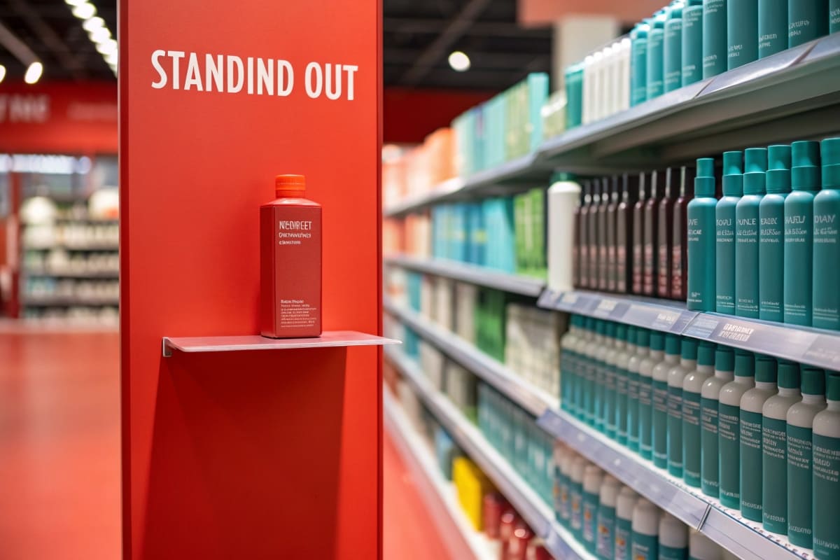
How Can You Use Color to Stand Out on a Crowded Shelf?
Your product is superior in quality, but it's physically disappearing on the shelf. It's placed next to five other brands that all use the same color scheme.
To stand out, you must disrupt the visual pattern10 of your category. Analyze the dominant colors used by your direct competitors, and then intentionally choose a color that creates a strong contrast. This "color break" will draw the shopper's eye instinctively.

This is where art meets science. I call it "strategic disruption11." Go to a grocery store and walk down the cereal aisle. You'll see a lot of reds and yellows. Then, you'll see a purple box, and your eye will go right to it. That's not an accident. The designer knew the category was saturated with warm colors and chose a cool color to break the pattern. Before you even begin designing, you or your marketing team must do a shelf audit12. Take photos of the shelf where your product will live. What is the dominant color? Is it a "sea of blue" like in the water aisle? Or a mix of greens and browns in the organic section? Your job as a designer is to find the empty space in the color spectrum and own it.
Your Strategy for Shelf Dominance
Being different is more important than being perfect. A slightly "off-brand" color that gets noticed is better than a "perfectly on-brand" color that is invisible.
- Audit Your Competitors: Create a simple mood board13 of your top 3-5 competitors' packaging. What are their primary and secondary colors? Identify the dominant color palette of your category.
- Find the Color Gap: Look for holes in the color landscape. If everyone is using blue and green, consider a bold orange or a clean, minimalist white. If everyone is loud and colorful, a simple black-and-white design can stand out as sophisticated and confident.
- Test for Contrast: Use mockups to place your design next to your competitors. Does it pop, or does it blend in? In the first three seconds of a shopper glancing at a shelf, you need your color to do the heavy lifting and grab their attention.
Conclusion
Color is a silent salesperson14. It communicates emotion, targets demographics, and can make your product the star of the shelf. Understanding its psychology is essential for designing packaging that truly sells.
Explore how color psychology influences buyer decisions and emotional responses, enhancing your marketing strategies. ↩
Discover the subconscious emotions that colors evoke, helping you design more effective packaging. ↩
Understand the importance of color choice in packaging to enhance product visibility and boost sales. ↩
Explore best practices in packaging design to create products that attract and retain customers. ↩
Find out why vibrant green can significantly increase sales and attract customers. ↩
Explore the emotional associations of colors to better connect with your target audience. ↩
Learn how to use colors to build trust and reliability in your brand's image. ↩
Understand how age, gender, and culture affect color preferences to tailor your designs. ↩
Explore how cultural background influences color interpretation to avoid branding mistakes. ↩
Discover strategies to disrupt visual patterns and make your product stand out on the shelf. ↩
Learn about strategic disruption to make your product stand out on crowded shelves. ↩
Understand the importance of a shelf audit to enhance your product's visibility in stores. ↩
Find out how to create a mood board to visualize and refine your packaging design ideas. ↩
Understand how color functions as a silent salesperson to enhance your marketing effectiveness. ↩